What to Put in a Grant Workforce Narrative (and Where to Find the Data in Five Minutes)
Ask anyone who's written a federal or state grant application what takes the longest, and they won't say the budget forms. Those are mechanical. It's the narrative section. It's where the application actually gets won or lost, and it's usually the part that sits open in a browser tab for three days because the data you need to write it well doesn't live anywhere convenient.
U.S. Economic Development Administration says as much in its own applicant guidance. Reviewers want the narrative to paint a picture of the local economy: what conditions and needs exist, and how the proposed project answers them. That instruction gets scored. Most Comprehensive Economic Development Strategy (CEDS) narratives end up leaning on the same handful of sources every applicant in the state is also pulling from, BLS releases, state labor data (varies by state, e.g. your state's Department of Workforce Development), Census estimates, all of it published six to eighteen months after the fact.
That gap in the data is exactly where Rollie's dashboard fits in. Here's what a workforce narrative usually needs, and where each piece is already sitting in your account.
What reviewers are actually scoring
Pull back far enough from any specific program, whether that's EDA Public Works, the Good Jobs Challenge, a state EDO grant, or a foundation workforce grant, and the ask is nearly always the same handful of things:
Proof there's real economic need: unemployment that's elevated, wages that are flat, an employer base that's thinning out
Proof there's real demand: which industries and companies are hiring, and for what kind of roles
Real geography: not "the region," but the counties, cities, and zip codes a reviewer can find on a map
A tie back to an existing strategy: usually the CEDS or its local equivalent
A case for timing: why this, why now, what changes once it's funded
Most applicants get stuck on the first two. They either bring in a consultant or wait for the next quarterly BLS release. You've already got a live version of both sitting in your dashboard right now.
Where each piece actually lives in your dashboard
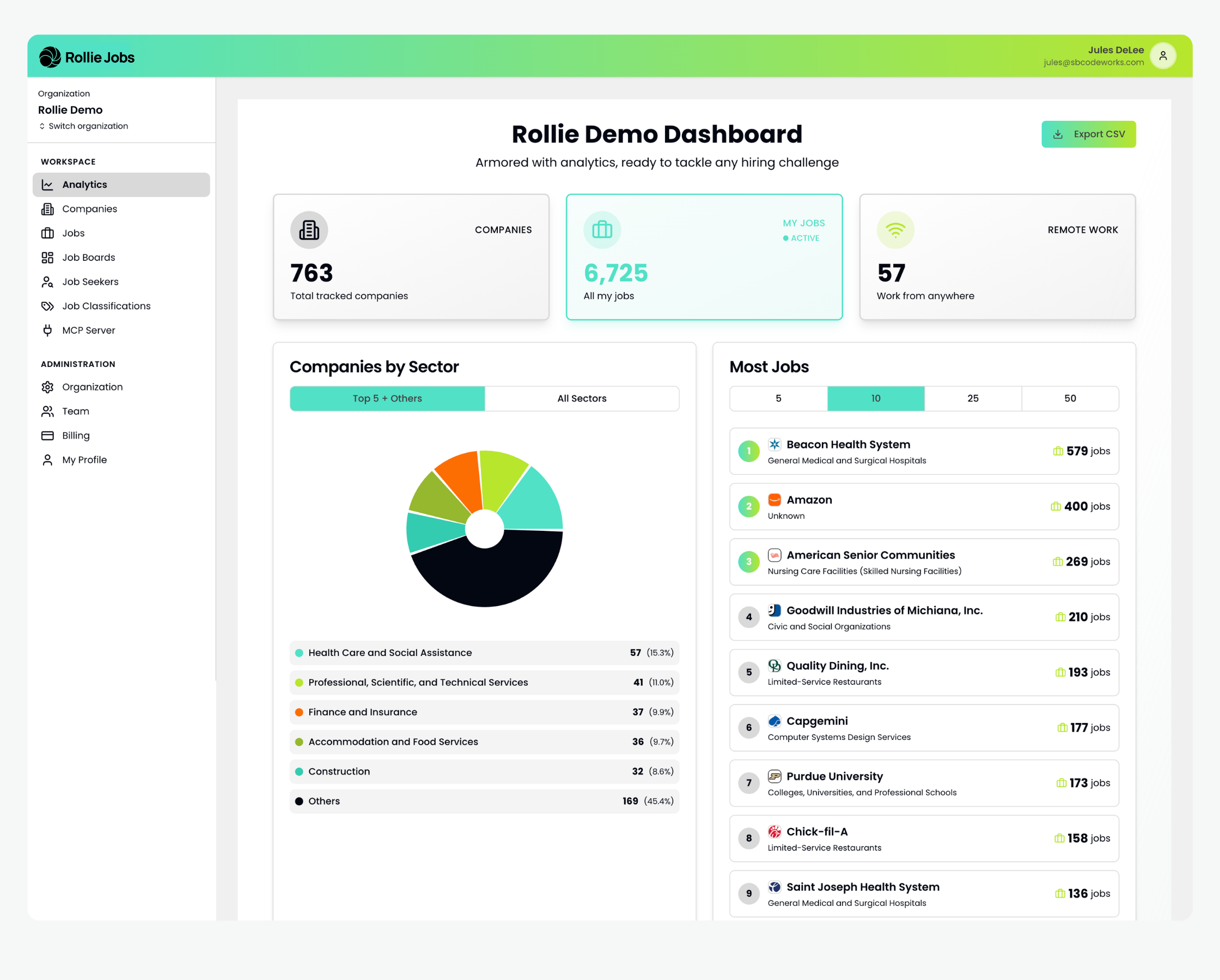
Take the Rollie Demo dashboard as an example and walk through where each narrative requirement gets answered.
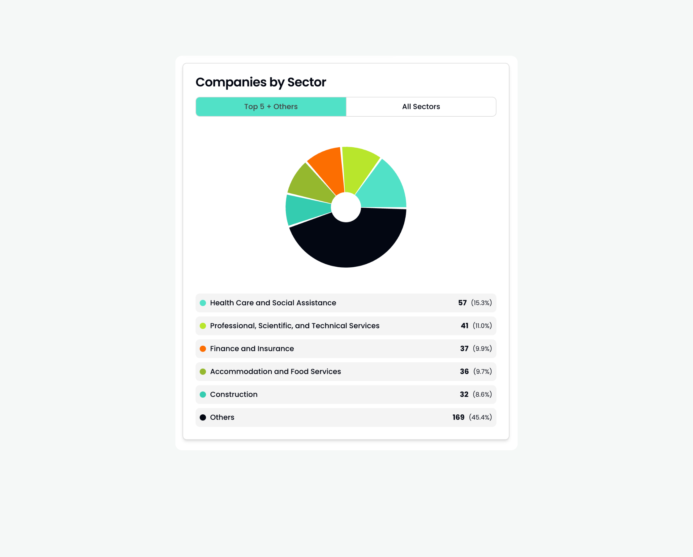
Start with the industry mix. The Companies by Sector pie chart has already done this math for you. Health Care and Social Assistance sits at 15.3%, Professional, Scientific, and Technical Services at 11.0%, Finance and Insurance at 9.9%, Accommodation and Food Services at 9.7%. Turn that into a sentence and it reads like something a reviewer expects to see: health care and social assistance represents the largest single sector among tracked employers in the region, followed closely by professional and technical services and finance. No consultant call required. Export the CSV and the percentages are sitting right there.
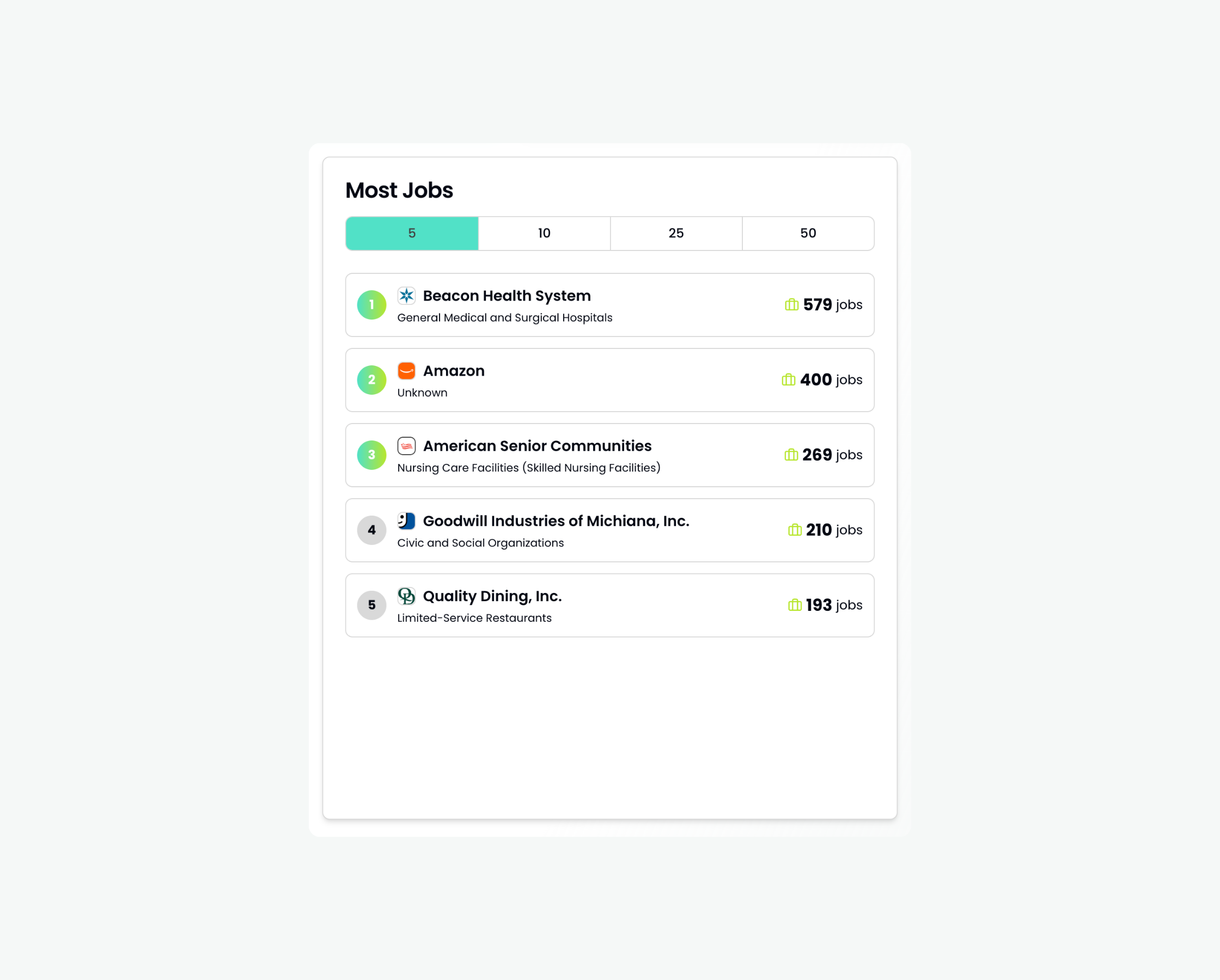
Then there's demand, and this is where a live jobs platform does something a labor market report simply can't. It names names. In this illustration, Beacon Health System shows 579 open roles on its own. Amazon has 400. American Senior Communities has 269, and Goodwill Industries of Michiana has 210. Numbers like these, pulled from your own region's live data, mean a reviewer isn't looking at a modeled estimate of healthcare or logistics demand anymore. They're looking at named employers actively hiring right now, which is the kind of detail that makes a narrative feel like it was written this week instead of copied from last year's application.
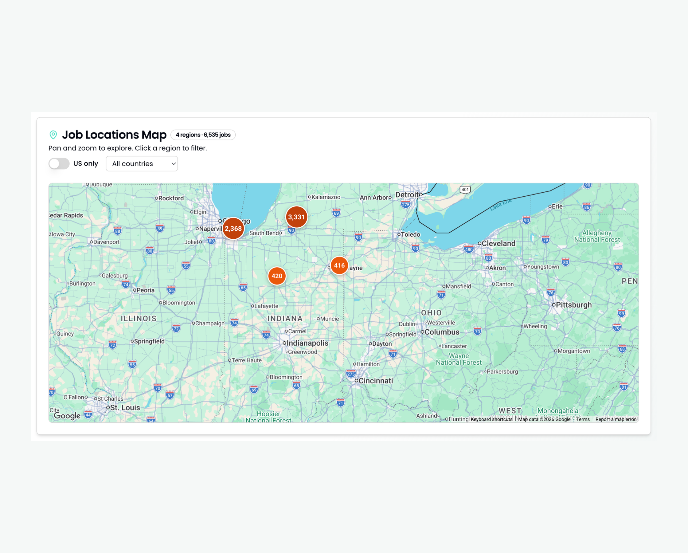
Geography works the same way. Reviewers keep asking for counties and cities, not "the region," and the map view hands you that without any extra work. In this example, one metro cluster shows 3,309 jobs, a second shows 2,363, and smaller pockets of 414 and 412 sit further out across the surrounding towns. That's the raw material CEDS narratives (iedconline.org) specifically call for: a region defined by real places, not a placeholder phrase.
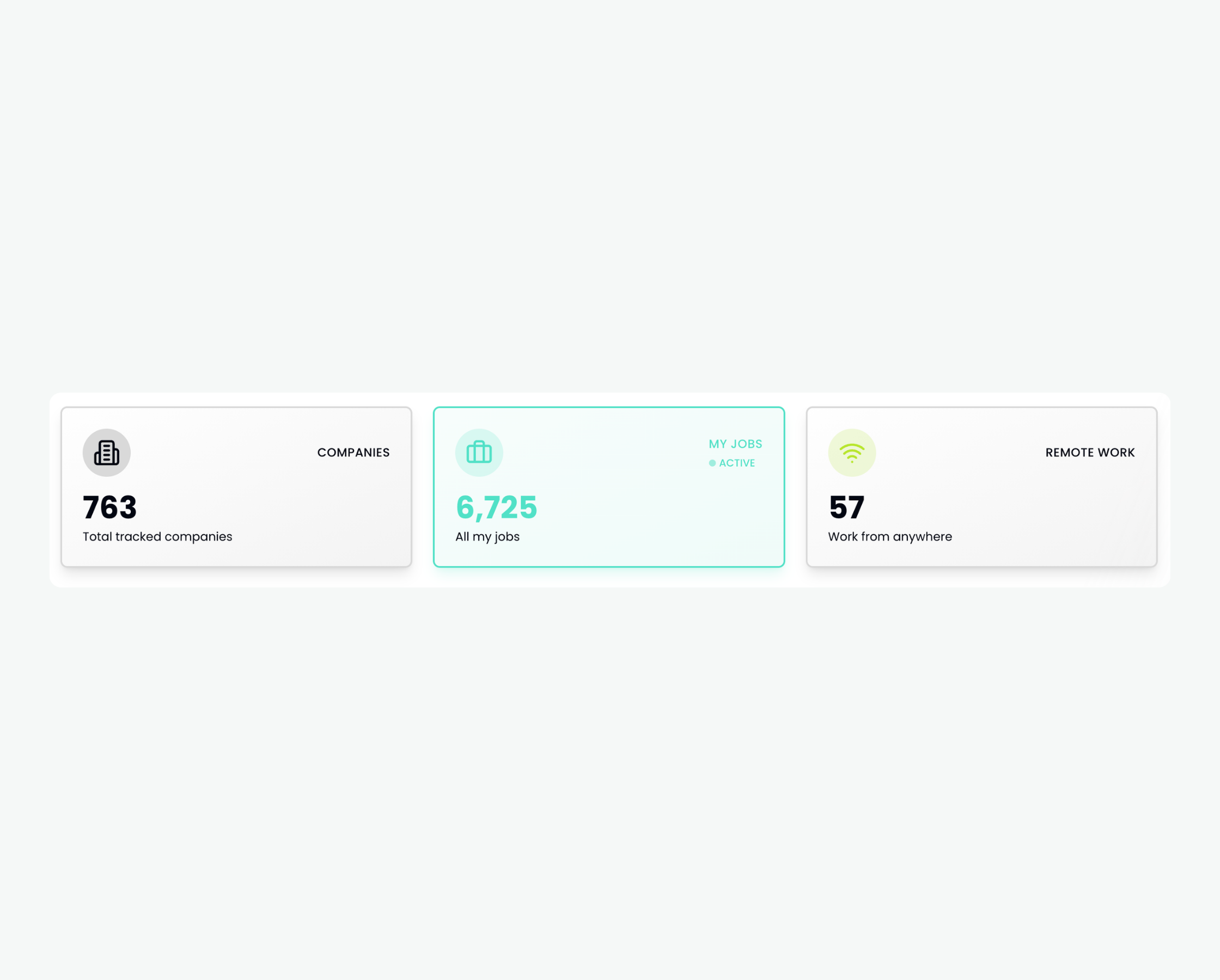
This example shows 763 tracked companies, 6,723 active jobs, 57 remote-friendly roles. Numbers like these back up a narrative's credibility ("this analysis draws on continuously tracked data across 763 regional employers"), and they come back again later in the application, in the section where funders want to know how you'll actually measure impact after the money lands.
Why fresh data reads differently than old data
Reviewers see the same three-year-old BLS table cited in half the applications that cross their desk. It stops meaning much after a while. A dashboard export with an actual date on it tells a different story: this region is watching its own labor market in real time, not just repeating a number everyone else already quoted.
Rollie doesn't replace your CEDS, your BLS citations, or your official distress documentation. Those still have to come from the federal and state sources reviewers expect. What Rollie gives you is the layer underneath all of that: the specific employers, the actual roles, the real geography, the stuff that makes a distress statistic feel like it's describing this month instead of three years ago.
How to actually pull this together
Start with the sector breakdown and write your paragraph on industry mix. Move to the top employers by open roles and write the paragraph on demand. Pull the map for your target counties and write the paragraph on geography. Export the CSV, date it, and attach it as an appendix. Then cite your CEDS or regional strategy document right alongside it, so the live data is backing up the official record instead of standing in for it.
That's the whole workflow. A few minutes in the dashboard, a few paragraphs that sound like they were written this week, because they were.
You can also see how this plays out in practice in What 4,000 Live Job Postings Tell Me That Your Workforce Study Can't and How Greensburg Went From 1 Job Listing to a Regional Hiring Hub, both of which use the same live-data approach in a real regional context. And if you want the full picture of how Rollie supports EDOs beyond grant writing, that's covered on our Economic Development Organizations page.
If your EDO uses Rollie and wants a walkthrough of pulling this data for a specific grant application, book time with our team!